Wells Fargo

Experience Design

Wells Fargo's Experience Design Team advocates for the customers (represented by a massive portion of the country) in creating the best possible experience for users of the Web and mobile app.

Wells Fargo decided to undertake a large re-branding effort. Working on one of the most technical Scrums in the Customer Experience department, I lead visual design efforts beginning with updating the mobile app experience -- targeting user pain points through data analytics and user feedback.

Utilizing a modernized logotype, a new stagecoach with clean, minimal lines, along with a brighter and condensed color palette, the Mobile Apps team helped create and leverage the global re-branding effort to re-vitalize the mobile app (as well as Desktop and Tablet overhauls of the main Account Summary and Account Detail screens, the 2 most visited pages within the servicing portal).

App Icons

Another aspect of Wells Fargo’s massive brand update and visual re-styling was a large reduction in the color palette, to better maintain consistency and convey interactions and messaging with fewer colors.


Critical to this re-branding effort was a complete App Icon re-design for iOS and Android, which leverages the new stagecoach and logotype assets from the rebranding effort to better showcase the new branding and signal to users the large overhaul in Visual and Experience Design.


The app icon was designed to meet the standards of Apple and Google (supporting all shapes of masks around the artwork), but also to leverage the modernized, solid-filled stagecoach to make Wells Fargo more attractive and up-to date with it's core user base while still retaining its heritage. The stagecoach pops on a brighter, refreshed Wells Fargo Red, and the new vibrant yellow underlines and grounds the stagecoach in space.

Welcome Screen

While working on the mobile app, one of the most important re-branding efforts was a new Welcome Screen with an accompanying animation to transition the user from login to their Account Summary page.


The Welcome Screen leveraged some of the first approved rebranding assets as part of the Mobile Apps Team. In line with the visual and messaging pieces of the rebrand, the goal was to provide a clean layout and a friendly greeting for the user. A bright white background with the stagecoach in Wells Fargo Red helps balance the greeting that fades in first, slowly guiding the user from their personalized greeting (and last sign-on) down to the distinct, Wells Fargo stagecoach.


Besides the Welcome Screen itself, an important aspect of the Welcome Screen is the transition from the greetings into the user's overview page -- Account Summary. This animation had to be scripted to a very specific, short length due to highly-regulated company requirements, but simultaneously ease the user from their login page into their home screen while the content loads in the background. This animation can be seen by logging into the Wells Fargo app.

Ending Daily Balance

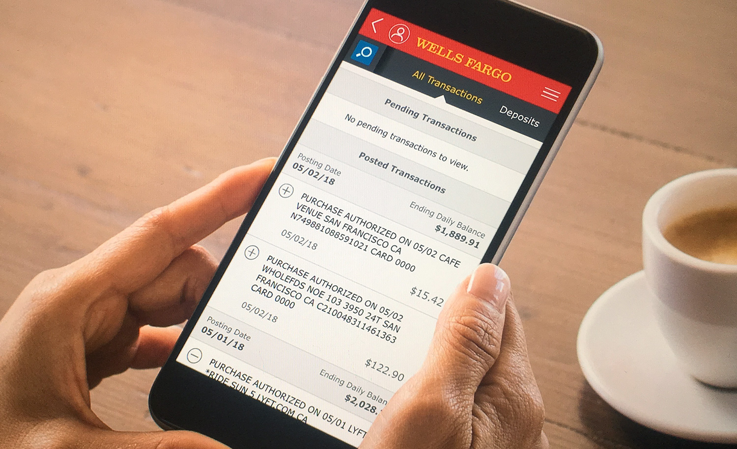
I also explored overhauls of the visual design and UI patterns to update the What’s New modal, which displays new feature launches to users upon login. In addition to informing users of other product/feature launches, it showcased the Ending Daily Balance feature that I designed with our partners. The Ending Daily Balance reduced significant cognitive load for users scanning their transactions to get their available balance at a glance.


While this was a relatively straightforward feature to design in terms of user experience and visual design, the largest challenge was working with Engineering and the bank's legacy system of record to integrate these easily-readable header tile for each date.


Due to its high visibility and ease of use, this feature stood out as one of the most positively-received additions by our team, encouraging large amounts of positive feedback from customers while simultaneously creating significant savings for the company in users checking their balance.

Conclusion

Over the course of several months as the sole visual designer the Mobile Apps Team, the features and assets I created as visual designer within our team raised the company’s Apple App Store rating by at least 2 stars and helped bring Wells Fargo in-line with their competitors:


  • Lead visual design efforts for high-profile Wells Fargo customer experience on mobile and browser platforms to target user pain points and improve customer satisfaction.

  • Integral to Wells Fargo's latest re-branding effort, overall styling, photography, design system tools and components, and integration into banking service features.