Tesla Model S

As UI/UX Design Intern at Tesla Motors, I was part of the software team on the Model S in-car touchscreen. I worked with the team of engineers to create a cohesive and visually appealing user interface that puts all of the car's functions into a stylish and accessible package.

The design aesthetic I initially established for the Model S makes the UI attractive as the car's design, while incorporating a unique visual language that is intuitive for all drivers independent of their technical knowledge.
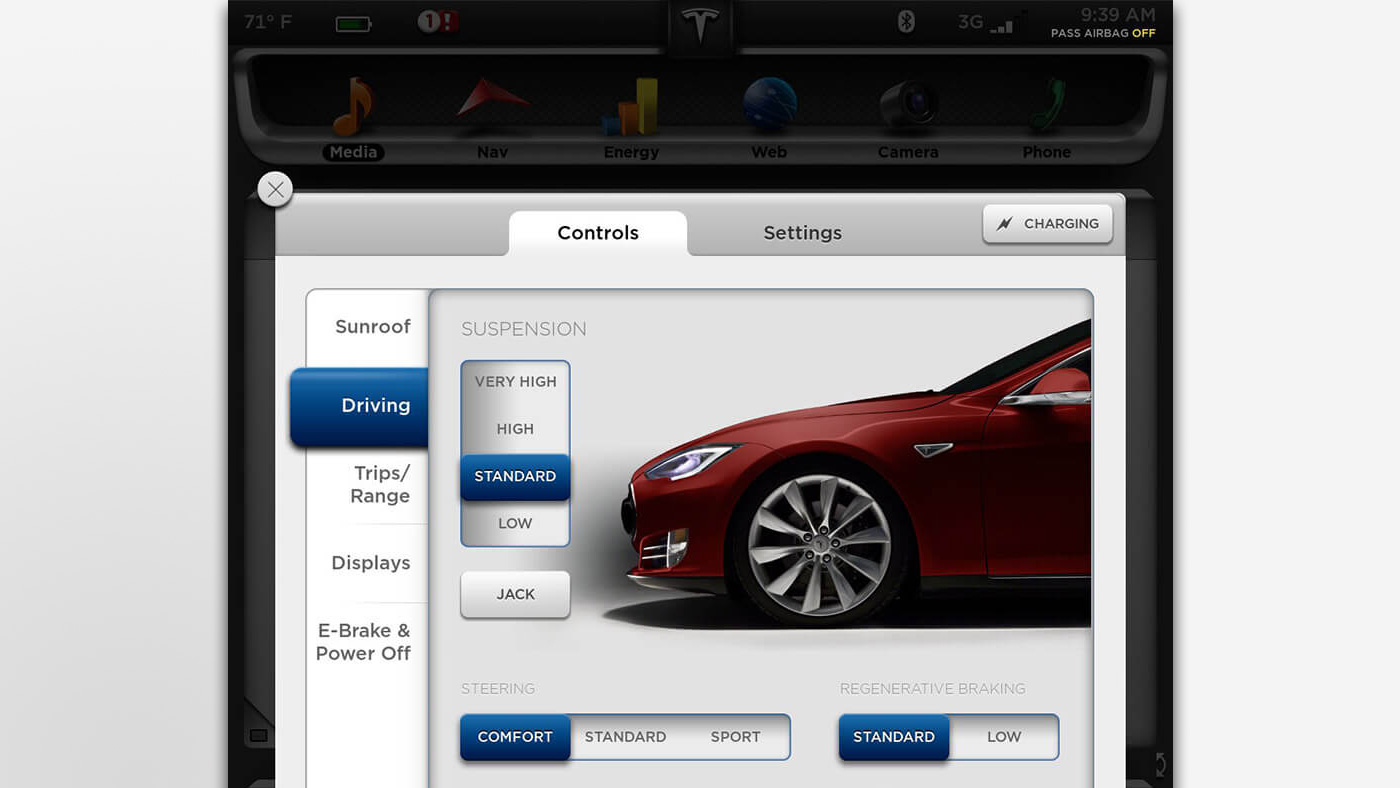
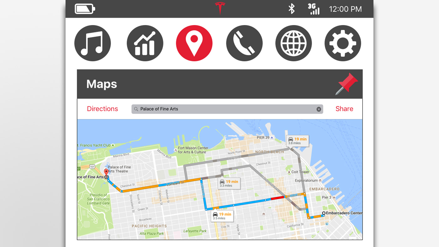
Early Prototype

Much attention was paid to the context of the touchscreen. Because the user is driving, it was important that the screen's layout is intuitive and the buttons were easily accessible with one hand. Furthermore, the amount of user actions needed to achieve a goal needed to be minimal so as not to detract the user's attention from the road.

Due to the unprecedented size of the screen multiple apps were designed to be displayed at once. The layout below illustrates this "stack" system: the 2 apps can be switched in their position, pinned in place, or removed when a new app is opened.

UI Elements

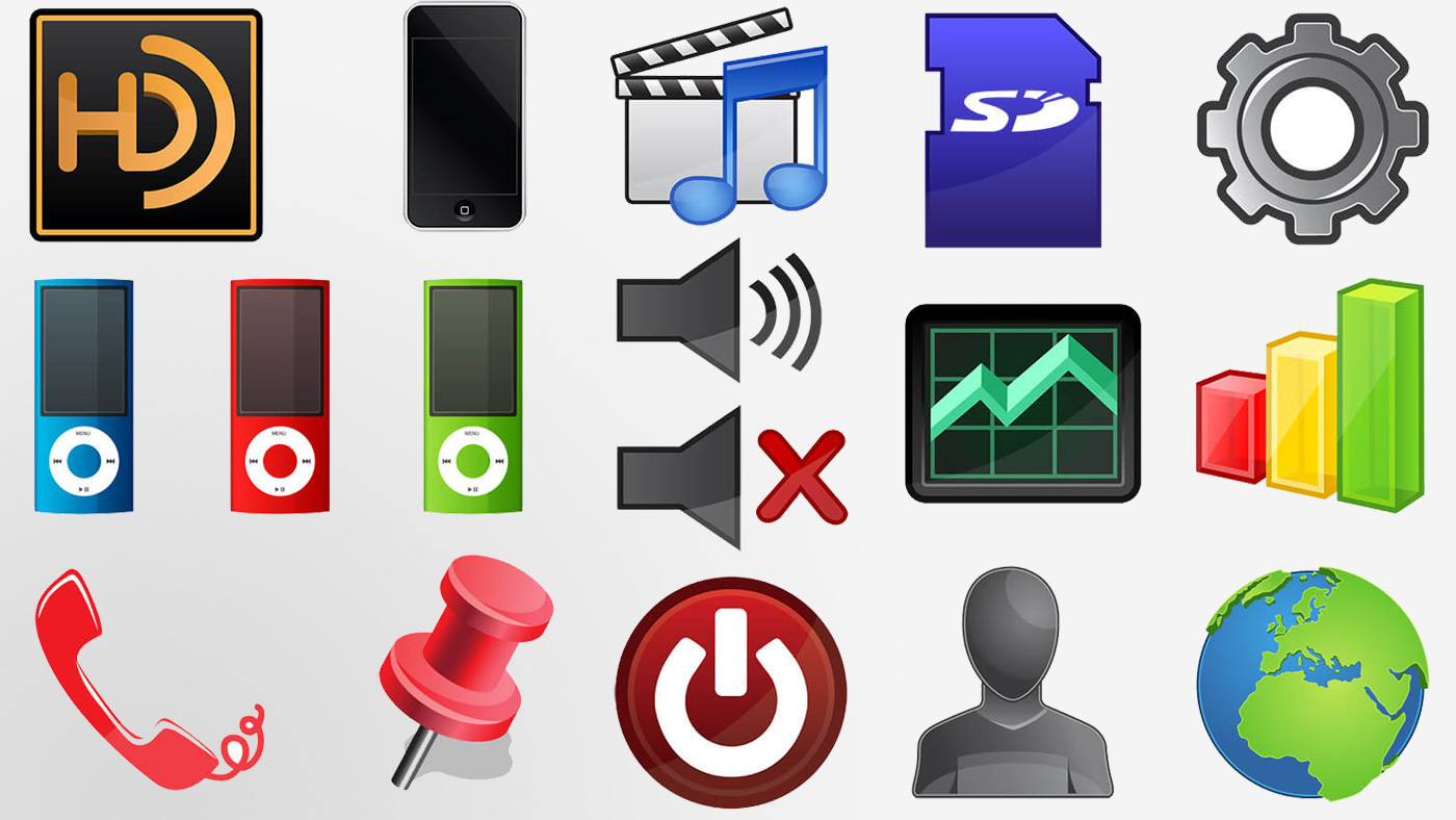
Due to the Model S being the first vehicle made by Tesla Motors using this powerful touchscreen technology, I rapidly iterated a set of vector graphics for the user interface that have a clean, modern icon style while being unique enough for a cutting-edge electric car.

Below are some samples of initial icons and UI elements that were adopted into the early Model S user interface.