Areas for Improvement
Due to an aggressive GDC deadline, one area for improvement that could have benefited from additional resources was qualitative research. Before the GDC launch, most individual testing was limited and internal, but having our redesign launch during a large event meant we were able to rapidly find pain points in the new user experience and adjust accordingly.
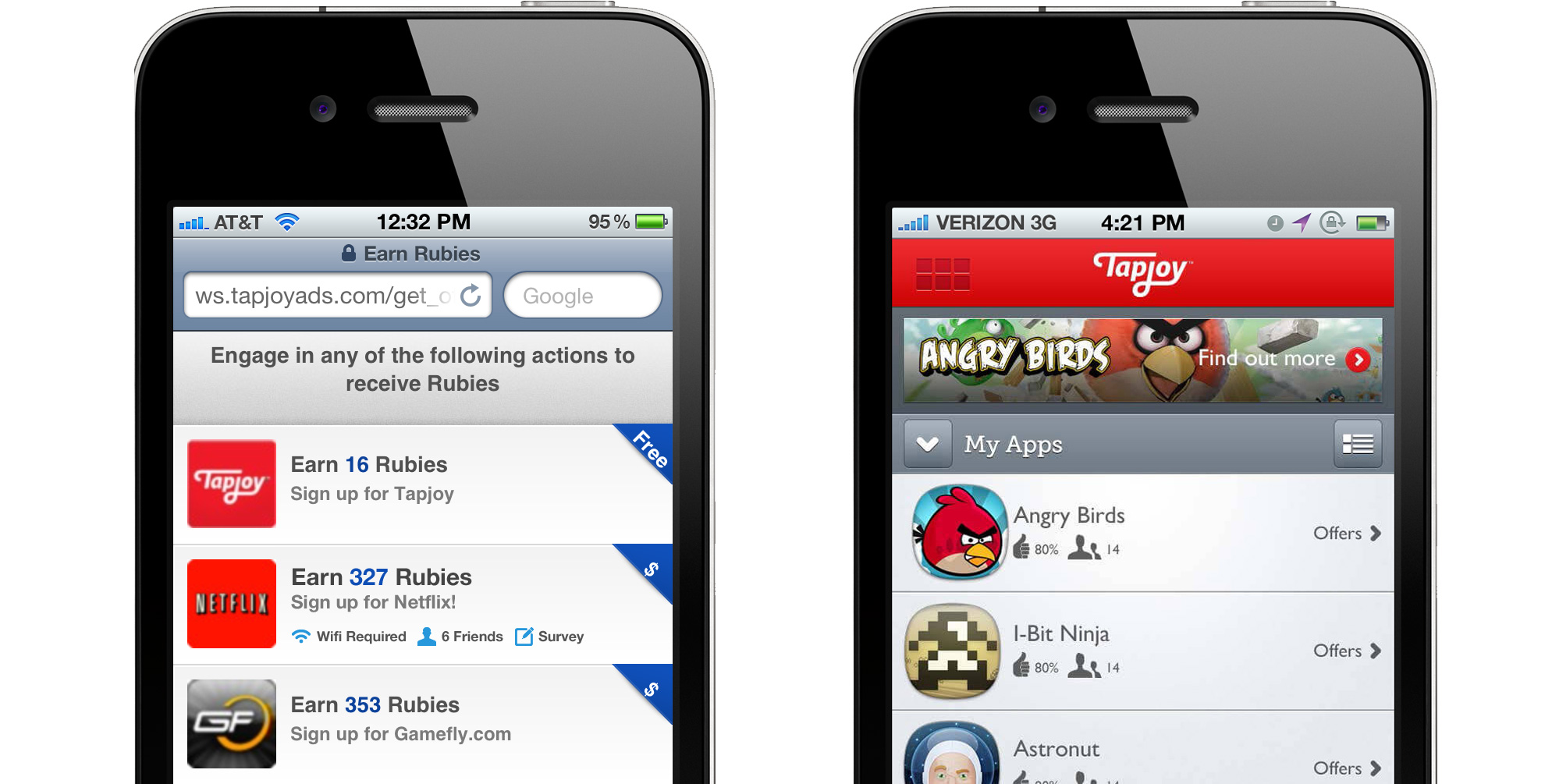
One pain point that very quickly surfaced when we gained new users was our main mobile navigation UI pattern. In 2012, many mobile UI patterns had not been established. Attempting to solve mobile navigation on low resolutions, our team worked with engineering to implement a "waffle"-style navigation pattern similar to the currently widespread hamburger menu. By burying our core navigation in a slide-out menu in the top-left corner of the screen, we woke on launch day to a massive drop-off in users reaching the main Offerwall screen of the Marketplace, which is core in providing users offers and driving Tapjoy's revenue.
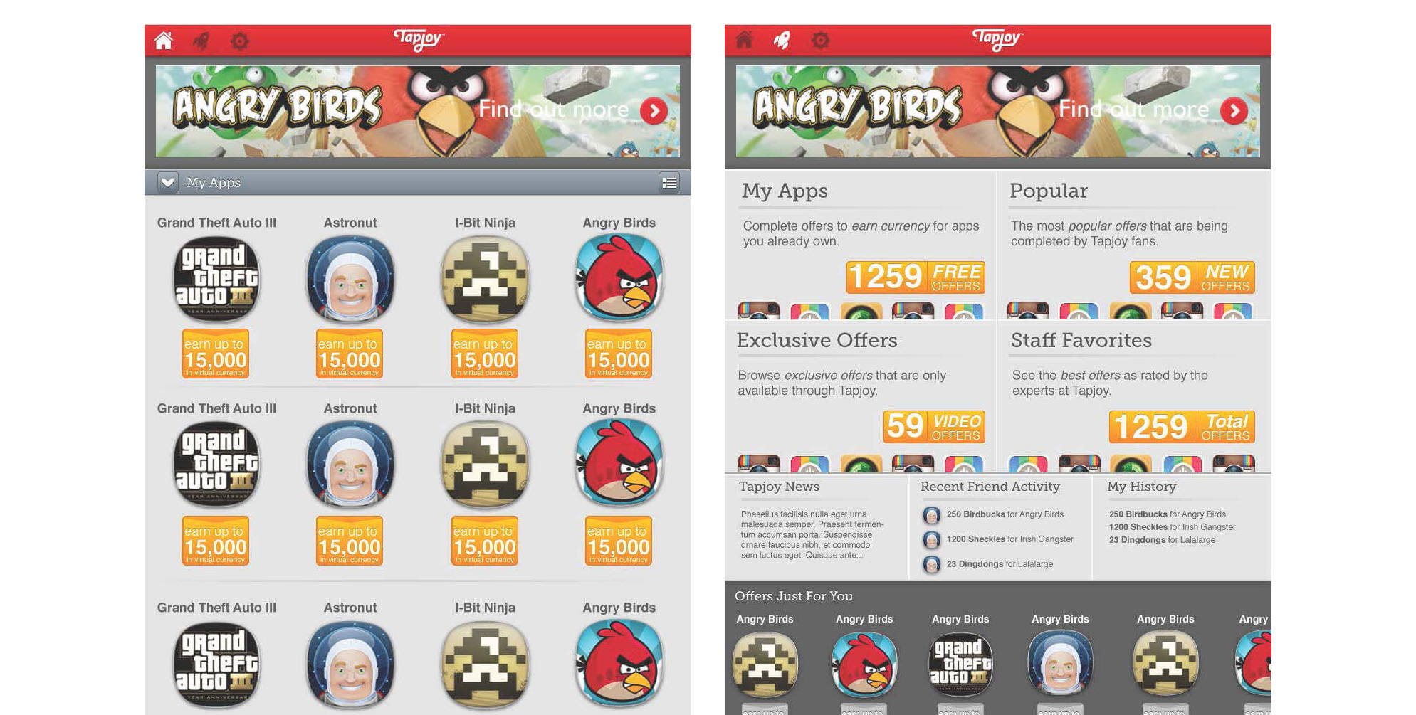
I addressed this issue by designing a simpler navigation that was better-suited to users' UI expectations for mobile apps at the time -- a simple line of icons in a mobile navigation bar. These icons allowed users to reach core screens such as Home, Explore, and Settings directly from the main navbar at any time. Especially important was this one-touch interaction to reach Tapjoy's "Explore" screen, where new apps and offers could be discovered based on the user's history and preferences to drive Tapjoy's revenue and get its users to the main action of accepting an offer in return for virtual currency.
