As part of my design role at Tapjoy, I lead the complete design overhaul of the B2B Console. I met with many product managers and stakeholders to research the needs of our business partners and simplify the console's tools for advertisers, publishers, and developers.
While making the console more accessible, one massive improvement was fitting the console on tablets and phones to greatly expand its reach across devices.
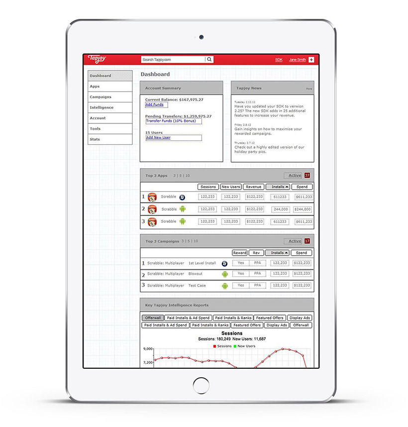
Dashboard
The dashboard is the homepage for the B2B console. It provides the user with an overview of their account, Tapjoy news, top performing apps and advertising campaigns, and key analytics.
All of the user actions were mapped out through flowcharts and then integrated into a prototype. Through this process we found many ways to simplify the amount of information displayed per the user's needs, and were able to isolate and remove years of feature creep.
Furthermore, through user research I found many of our business users were accessing the dashboard via tablets, so the simplification of the UI allowed the site to be loaded on larger mobile devices.
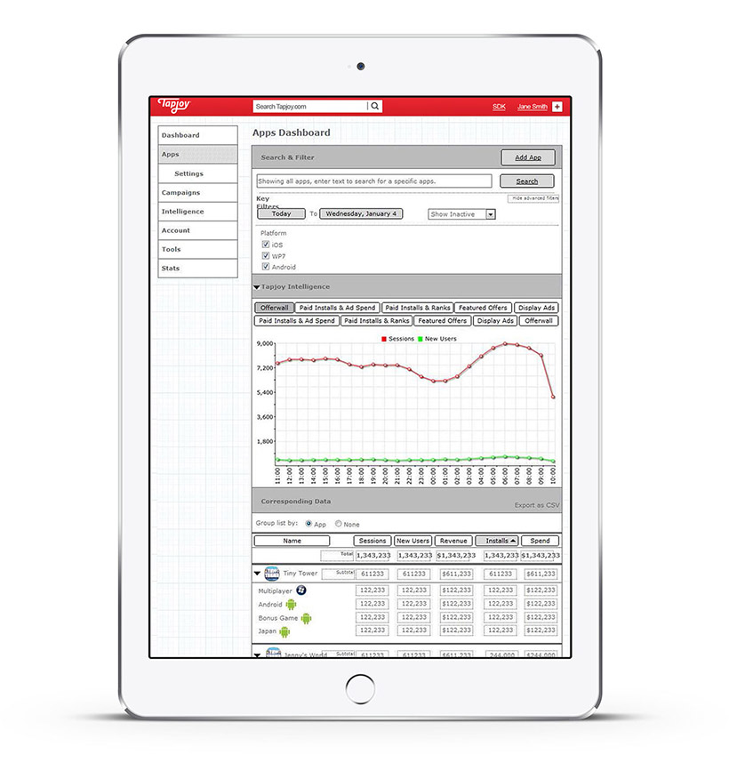
Apps Screen
The Apps screen shows the user their top performing apps on the Tapjoy Marketplace. Apps can be searched, filtered, and tracked to allow developers more flexibility with advertisers.

