Mobile Survey App

This was a rapid prototyping exercise to build a quick and intuitive survey app that companies can send to their loyal customers to improve products and services.

With a one-day self-imposed limitation, this survey app needed to include: wireframes / user flows, a simple and intuitive interface and overall user experience, and friendly start and finish screens to give the user feedback during the process.

As an additional constraint, I designed this mobile prototype at a 360x640px resolution, so that it would suit devices (and customers) of all types.

Note: This app is not affiliated with Nike, but used the brand as an example to showcase the many options for customization of color, UI elements, and more.
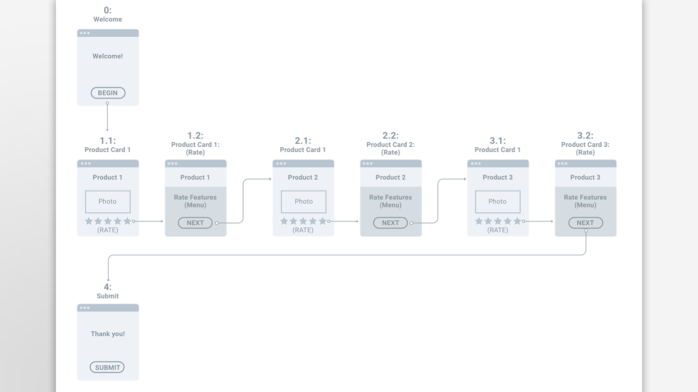
Wireframes / User Flow

The first step in the UX design process was to research other mobile survey apps, their limitations, and the best examples for intuitive UI/UX patterns.

This rapid reserach phase was then quickly rolled into low-fidelity wireframes that show the user flow through the app. With only 1-2 minutes to keep the user's attention, a key goal was to use as few steps and interactions as possible to get the user from start to finish in rating products.

The main focus of this survey app is to gather information on the products via the customers, so the scope was limited to:

  1. Intro / Begin Screen
  2. 3 Product Card Screens with Rating Overlays
  3. Submit Feedback / Finish Screen

High-Fidelity UI Designs (Prototype)

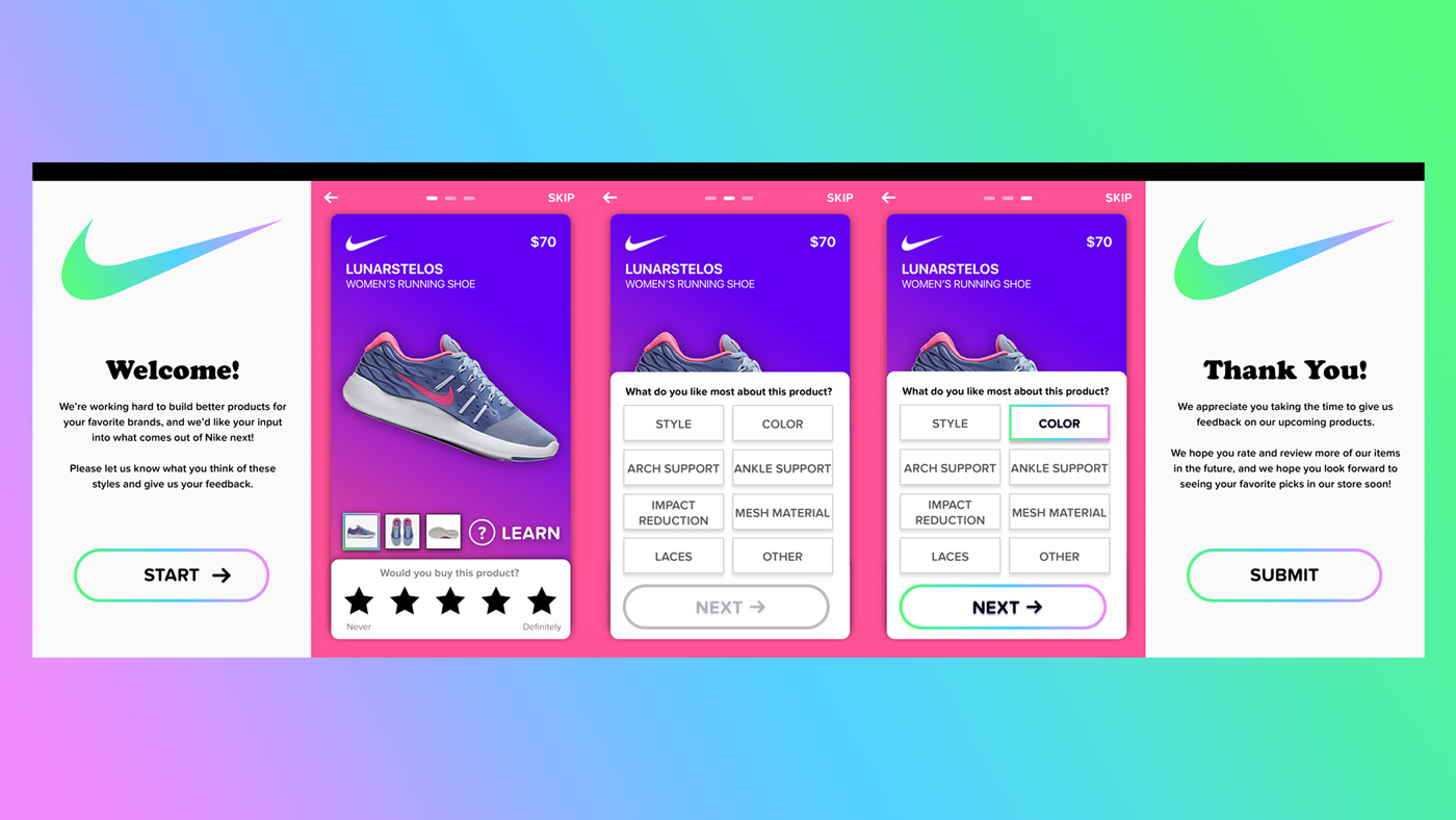
The high-fidelity protoype illustrates clearly how the survey app functions:

Presented with an initial "Welcome" screen, the user presses the bright-colored BEGIN button to start rating products (in this case: shoes).

The user then slides through 3 screens of product "cards," the amount of which is indicated at the top of the screen in the navigation. This navigation is also used to figure out how far along the rating/feedback process the user is.

By using the satisfying swipe gesture, the customer/user can slide between cards until she wants to rate a particular product. She can investigate the features of the shoe by tapping the LEARN button, or tap the amount of stars out of 5 she would use to rate the overall product.

Once a star rating is tapped, the rating menu slides up over the product card and asks her what feature she liked most about the product. After selecting a feature, she activates the main call-to-action (SUBMIT) to get feedback on her actions from the app before it moves to the next product card.

Finally, upon finishing rating the products from the campaign she's reviewing, the user is presented with a Thank You page which allows her to submit her results to the advertiser/brand. If at any time she wants to go back to review a past product or change a rating, she can use the intuitive navigation at the top of the page or swipe right.